Use REM for everything, not only font size
You've probably been told to use REM instead of pixels for font sizes, but I think you should use it for everything. Here's why.
According to MDN we have seven absolute length units:
cm- centimetersmm- millimetersQ- quarter-millimetersin- inchespc- picaspt- pointspx- pixels
If you use an absolute length unit as a value on something, for instance width: 200mm, this something will get 200 millimeters wide. The first six of these are used for prints, so when creating a website you can mostly ignore these (unless you want to alter the way the printed version of you're website should look like).
Pixels (px) is the only absolute length unit we're using in web development. However, you've probably been told to use relative length units when working with fonts (although you may not know why).
Relative length units are:
em- relative to the font size of the element itself, or the nearest parent that has font size declaredrem- relative to the font size of the root element (in a website this means thehtmlelement)%- relative to the parent element's widthch- relative to the width of the "0" charactervhandvw- relative to the viewport's height and width respectivelycqw,cqh,cqi,cqb,cqmin,cqmax,vmin,vmax,dvh,svh,ex... and many more that have come in the last couple of years that I'm not going to explain further
When it comes to font sizes we should use the rem unit. The reason for this is not complicated, it has to do with allowing our users to decide for themselves the size of fonts in their browser. If a website's font size seem too small for me I can change this.
For instance, in Chrome I can go to Settings -> Appearance -> Font size and select Very large. This will make Chrome override the font size of the root element (html) and increase it by 150%. The base font size of an html element is 16px in most browsers, meaning the font size gets bumped up to 24px (150% of 16). When this setting is active, all rem values are calculated from 24px, not 16px. Here's what this means:
html {
  font-size: 24px; /* set by the browser's settings */
}

button {
  font-size: 1.25rem; /* will become 30px because 24 * 1.25 = 30 */
}
This is best practice. Give power to the users. However, most developers only use rem for font size and nothing else.
The perks of using REM for everything else
If you only use rem for font size the font size will increase if the user says so, but all other elements will stay the same size. Let's have a look at the button from the last example:
button {
  font-size: 1.25rem;
  border: 1px solid black;
  border-radius: 4px;
  padding: 8px 12px;
}
Now, it may be hard to imagine what this would look like, so here's an example:
The demo makes it so that if you adjust the range slider you'll see how this button's font size would change if the root's font size changes. As you may notice, the border, padding and border-radius does not change because they're declared in pixels (px). Using rem for these properties will work better — the button scales relative to the root font size.
button {
  font-size: 1.25rem;
  border: .0625rem solid black;
  border-radius: .25rem;
  padding: .5rem .75rem;
} In conclusion
I'm not saying to use rem everywhere, but you should be aware of how your design will look if the user changes the root font size in their browser. If you use ch or em, these units are relative to their nearest element's font size, and that font size is relative to the root's font size. And there are absolutely cases where you would use percentages (%).
My point is: using rem for everything is almost a catch-all fix. And no, it's not that hard to learn. After using it for a while you don't need a rem-to-px-converter, you'll just "know" that 1px=0.0625rem.
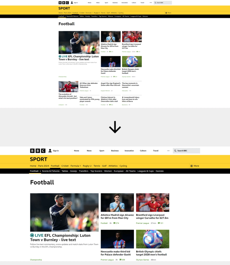
Don't take my word for it, have a look at Mirror's website...

...vs. BBC's website:
