A good way to structure your SCSS files
There's no correct architecture for SCSS files and the management of them, but here's how I do it and why it works for me.
When I work outside a JS project (React, Svelte etc.) where you have scoped CSS (like local <style> tags in Svelte, styled-components or emotion in React etc.) I use good ol' SCSS. A single CSS file for a website could easily grow to ~3000 lines or more. That's quite unmanageable, but luckily SCSS helps me create smaller, manageable chunks of code. Here's how I do it.
The "inverted triangle"
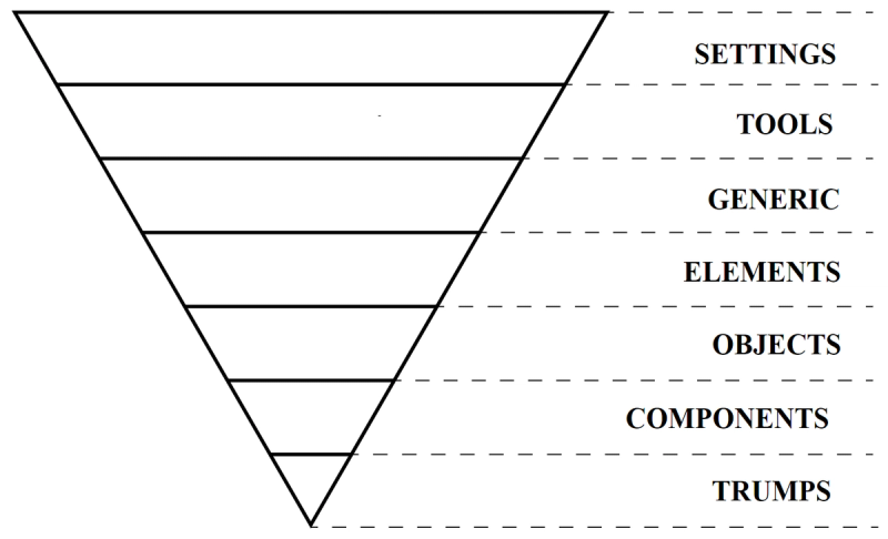
I structure my files based on a priniciple called "ITCSS" or "Inverted Triangle CSS", coined and invented by Harry Roberts. The idea is that you split your CSS code into smaller SCSS files, and import them in order based on their specificity — from low to high.

The image above suggests the following structure:
|-- settings
|-- tools
|-- generic
|-- elements
|-- objects
|-- components
|-- trumps
If we see these as folders, this is what they should contain:
- Settings
One or several files that stores all your SCSS variables or global custom properties. It should also contain font imports and their settings. - Tools
A collection of SCSS mixins and functions - Generic
Where you would put a reset file, if your project has one. - Elements
Here you put in all the styles that should apply to HTML selectors globally, like styling thebody, headings (h1,h2etc.) or links (a). - Objects
This is for simple classes that do one thing, like a class that adds a max width to an element, or a wrapper class. - Components
Here we store the files for all of our components, preferably one file per component. The components should have a class named after the component, giving us files likeheader.scssfor a "header" component,cta.scssfor a "call to action" component,card.scssa "card" component and so on. - Trumps
Sometimes we need to override something, for instance when we create a visually hidden class as a way to hide things without removing them from the accessibility tree. We keep these kinds of classes or selectors in this folder.
Bringing it all together we can import the files like this:
// Settings
@import 'settings/colors';
@import 'settings/fonts';

// Tools
@import 'tools/media-query-mixins';
@import 'tools/px-to-rem-function';

// Generic
@import 'generic/reset';

// Elements
@import 'elements/html';
@import 'elements/body';
@import 'elements/headings';
@import 'elements/links';

// Objects
@import 'objects/max-width';
@import 'objects/landscape-orientation';

// Components
@import 'components/header';
@import 'components/footer';
@import 'components/cta';
@import 'components/card';
@import 'components/nav';

// Trumps
@import 'trumps/visually-hidden';
This is neat and tidy, easy to manage. However, while this is one way to do it, I do it a bit differently.
My approach
I use a combination of these rules, but with my own personal tweaks. Here's my setup:
|-- reset
|-- settings
|-- tools
|-- base
|-- components
|-- layouts
|-- utils
- Reset
Contains my custom reset file - Settings
Files that host variables for colors, fonts and spacing - Tools
SCSS mixins, functions or extensions. I rarely create a lot of tooling like these, perhaps just a mixin for@mediaqueries (like this one). - Base
Global styles for HTML selectors, likehtml,bodyora, same as "Generic" in the original setup. I rarely style headings (h1,h2etc.) or lists (ul,ol,dl) on a global level (for several reasons, but the main one being that the styles people normally add to these elements are styles that are meant for the content a rich text editor in a CMS generates. It's too intrusive to add those styles globally, I think) - Components
This is equal to the ITCSS structure above, with files likeheader.scssfor a.headercomponent,cta.scssfor a.ctacomponent,card.scssfor a.cardcomponent and so on. The big difference here is that I stay away from an "Objects" folder. Instead I create modifiers using the BEM naming syntax wherever I need a single-use class that alters something in a component. Like.card__image--full-widthinstead of a global.full-widthclass. If I need a global modifier to do something I store them in the Utilities folder (see example below). - Layouts
I work a lot with CMSes and therefore also layouts. In a CMS you often build reusable templates or layouts. One layout for the "front page" of your website, one layout for showing the details of a product etc. Layouts aren't really components per se (at least not in my mind), even though they are reusable, so I wouldn't put their styles in the "Components" folder. Therefore I have this folder. I use the same filename/classname system as I do with components, while also giving them a prefix ofl-, to indicate that this is styling created for layouts. I look at layouts like scaffolding. - Utils (utilities)
Giving that I use BEM modifiers for components I already have a decent system for "trumping" styles, at least locally within a certain component. I rarely need a global "trump", but when I do I create what I call utility classes, with a prefix ofu-. Examples of these include a.u-max-content-widthclass what I can apply to different sections of the website to hinder the content inside to grow wider than what the class indicates. A "wrapper" class, in other words. Also, a common one is a.u-visually-hiddenclass that I mentioned earlier, created to hide stuff from visual users without hiding them from assistive technology. Compared to the original structure these classes work both as trumps (because they are imported at the end of the stylesheet and therefore gets higher spesificity) and as objects (as they can be placed wherever in the code).
Also, I like to number my folders so that they appear in the same order as the import order inside my IDE:
|-- 01-reset
|-- 02-settings
|-- 03-tools
|-- 04-base
|-- 05-components
|-- 06-layouts
|-- 07-utils
Putting the rules to the test
This structure scales really well, but it may be hard to see that at first glance. Here's an example of the markup for a layout and where the styles for it are placed:
<body class="l-frontpage">
  <header class="header">
    <div class="header__inner | u-max-content-width">
      <a href="#" class="header__logo">Acme Inc.</a>
      <nav class="header__nav">
        <a href="#" class="header__link header__link--current">Home</a>
        <a href="#" class="header__link">Products</a>
        <a href="#" class="header__link">About</a>
        <a href="#" class="header__link">Contact</a>
        <a href="#" class="header__link header__link--icon">
          <svg
            xmlns="http://www.w3.org/2000/svg"
            viewBox="0 0 24 24"
            class="facebook-icon"
          >
            <path d="M15.4024 ..." fill="currentColor" />
          </svg>
          <span class="u-visually-hidden">Our Facebook page</span>
        </a>
      </nav>
    </div>
  </header>
  <main class="l-frontpage__main">
    <section class="l-frontpage__banner-section">
      <div class="banner">
        <div class="banner__image | u-max-content-width">
          <figure class="banner__image">
            <img src="banner.jpg" alt="Black anvil on a white canvas" />
          </figure>
          <div class="banner__content">
            <h1 class="banner__title">Welcome to our awesome store</h1>
            <p class="banner__tagline">Buy our awesome stuff.</p>
          </div>
        </div>
      </section>
      <section class="l-frontpage__products">
        <!-- etc. -->
      </section>
  </main>
</body> // Reset
@import 'reset/reset';
// Settings
@import 'settings/colors';
@import 'settings/fonts';
// Tools
@import 'tools/media-query-mixins';
// Base
@import 'base/html';
@import 'base/body';
@import 'base/links';
// Components
@import 'components/header';
@import 'components/banner';
// Layouts
@import 'layouts/l-frontpage';
// Utils
@import 'utils/u-max-content-width';
@import 'utils/u-visually-hidden'; As you can see, I use prefixes for some classes — l- for layout and u- for utilities — but not for components. You could argue that I should use c- for components as well to keep it consistent, but I see components as the de facto, and rather treat "abonormalities" with prefixes. It looks clean, in my opinion.
There are no right answers here. CMSes like Optimizely have these reusable components called "blocks" that editors can place wherever they want. For these cases it could be a nice thing to add a "Blocks" folder containing all styles for these, with a prefix of b-. This way you wouldn't confuse them with other, more spesific components like a "header" or a "contact form".
You are free to structure the SCSS files the way that makes sense to you. The trick here lies in the brilliance of the inverted triangle principle and its low-to-high spesificity import order, as well as using good naming conventions (like BEM) and a component-driven development approach.