My key takeaways from CSSDay 2025
For the third year in a row I was lucky enough to attend the CSSDay conference in Amsterdam. Here's a summary of what I've learned this year.
I'm not going through every talk, but for those curious this was the line-up.
It's OK to style scrollbars now
Adam Argyle showed off the many ways you can enhance scrollbars on your site, both aesthetically and functionally. Scrollbar styling is still kind of inconsistent between browsers, but we have so many ways to create fallbacks and progressive enhancements to having to worry too much about it.
Here's an incredible demo he showed off during his talk:
Some features are very experimental (so if you're looking at it on iOS Safari you probably won't see anything new), like styling the scrollbar arrow keys (that some browsers like Chrome have), but he made a point that if you just spend a little time on it, find out what works for you and your websites/applications, you'll give your users a nicer, more native-looking experience. Progressive enhancements is the key here.
Also: people grab scrollbar thumbs, so don't hide that shit. It's naive to think that everybody scrolls using touch, the mouse wheel or the trackpad. I immediately think of my father who still uses his computer like it's the 90s.
Talk. To. Your. Designers.
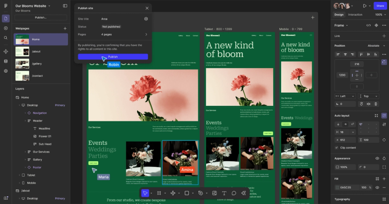
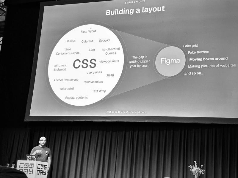
Several talks were about new features and modern way of dealing with old problems. This was a topic last year as well, the fact that designers still make pictures of websites. In light of the recent Figma updates this sentiment couldn’t have been more true. Figma released Figma Sites, promising responsive web design features. Still, after 15 years of responsive web design progress in the web medium they manage to boil it down to just meaning designing for three viewports: mobile, tablet and desktop.

CSS is more flexible than ever before, and the web should benefit from that. Features like @container queries, min(), max(), clamp(), grid and flexbox even have removed almost all need for micromanaging viewport breakpoints. Flex layouts lets a navigation bar wrap onto a new line if the horizontal space grows narrower and the items run out of space. Container query units can be used to decrease or increase margins, paddings or sizes based on a component’s context. clamp() can scale your font sizes. Grids can do layout shifts when necessary.
Figma sticking with the old “mobile/tablet/desktop”-methodology invites designers to continue the practice of just creating static snapshots of websites. The developers are left to do the "dirty work" (I'll come back to this), filling in the gaps and decide how their website should respond to its content.
Figma isn't the baddie here. It's a people problem — not a software problem. Sure, it's sad that their view of responsiveness boils down to device viewports, but they still do good work of implementing flexibility in the tool, like auto layout wrapping, the new grid system (although I haven't tried it yet) and flexible spacing. However, when it still lags so far behind the power of CSS it raises the question: should it even try?
My stance on this is that designers actually should continue to create static pictures of websites. I think that's fine. The prototype feature in tools like Figma is not for the developer's sake — it's for the stakeholders of the product you're creating. Designers need to create flashy prototypes to convince the people in charge to go with their idea, but as soon as the idea is greenlighted the real prototyping should continue in the browser. Designers and developers should work together in the browser when building stuff. Do the aforementioned "dirty work" together. Decide together how the website should look and feel on screens/windows where the viewport falls within "nowhere land" between the classic "desktop" and "tablet" sizes. Decide together how the website should look if the user changes their browser preferences (font size, colors etc.) or how a component should behave in different contexts. The web should be fluid and flexible, not static and predefined down to the perfect pixel.
I'll stop here. It's not the first time I've written about this topic (see the list below), but it's inspiring to hear the community building momentum on this. I have a feeling that we're soon coming to close on the old responsive way of thinking about websites that have existed for 15 years. I'm personally still a bit stuck in this way of thinking, but I'm vowing to try on my next project to release myself of the shackles of viewport-micromanaging to fully embrace the power of modern CSS.
Ahmad Shadeed had one of the conference's best talks this year. It was about smart, modern layout approaches. It was really encouraging to hear his view on this topic. He showcased some great examples of how we can create responsive layouts with modern features, without relying on the classic trifecta of media query breakpoints.

Previous writing on this topic:
The power of a CSS class name
Chris Coyier had a great talk about scoping and the new @scope at-rule. His talk was my favorite, by far. Such great energy, funny and inspiring. Besides the stuff about @scope I didn't learn that many new things, but it's nice to see big names like him telling me not to overthink things, to get a confirmation that my way of doing CSS is good (actually, I realised half-way through his talk that the reason "my way of doing things" equals his is because I've followed Chris for over 14 years, soaking up his knowledge along the way). Chris is an expert at this. His gave his take on scoping and why you don't need CSS-in-JS or utility class name frameworks like Tailwind when we have the good ol' way of scoping your CSS: just write a new class name. Have a class named .card and need a new card component? Name it .campaign-card and call it a day. He does this in such an elegant way, without diminishing the value of these other tools. He understands that they do serve a purpose for some. It's inspiring to hear people in this business being humble about these kinds of things, when so many developers are "in war" with each other over framework or language preferences.
Other takeaways
Two talks were about styling form elements, one about how you could style the <select> element in a neat, progressive enhanced way, and another was about the future of form control styling. I'm definitely going to explore this more, and do more progressive enhancements. With MDN being so good at communicating which features are supported where it's easier than ever to discover which browsers you'll need to be extra careful about or where it's a good idea to test newer features. Like the many ways to style <select>.
Brad and Ian Frost gave an interesting talk about design tokens. Funny and engaging, but I think I need to take their course in order to fully grasp the possibilities.
Amsterdam + CSSDay = ❤️
To sum it up: Lovely city, lovely conference. I'll definitely be back for 2026!